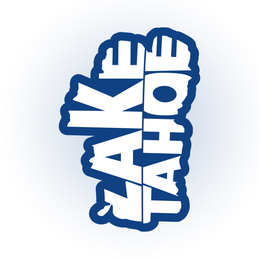
This logo was created as a tribute to Lake Tahoe, using the instantly recognizable silhouette of the lake as the foundation of the design. The goal was to create a mark that felt both geographic and iconic, capturing a sense of place while remaining simple, bold, and versatile across different products.
The design balances clean shapes with strong contrast to ensure it works at multiple sizes and across materials, from digital use to physical merchandise like stickers and chenille patches. By reducing the lake’s natural form into a clear, graphic symbol, the logo turns a real-world landmark into a memorable and wearable brand element.
3D Embroidery Patch
Lake Tahoe Shaped 3D Embroidered Patch – 4.5” Tall – Bring the Beauty of Tahoe to Life in Your Style!